Ipad App Interface Design
For This project we were asked to design a app to be used for the Ipad.
Research
I decided to do a app that can be used to watch TV shows or Movies on the go. I looked up a lot of different design for any kind of app like this one e.g. Netflix Hulu plus etc., hoping to get some idea about how I wanted the app to look like.
Navigation Chart
This is a simple nav chat showing the basic structure of my app.
Persona Chart
This is a persona chart, which shows who would be interested in the app. Mostly it would be for the young people but also I think it would be used by the older generation to , since almost everyone uses a ipad or even smartphone to watch TV or movies.
Ipad App Design
Main Menu
This is the main menu page for my app. Shows a variety of different options. Done using Adobe Illustrator. Mostly used shapes, text and gradient.
Types of Shows
TV Show

This page gives you the info about any TV or movie you click on. Done using the same method as other pages
Featured

This page shows you if there are any shows or movies featured. Done using the same methods as the other pages.
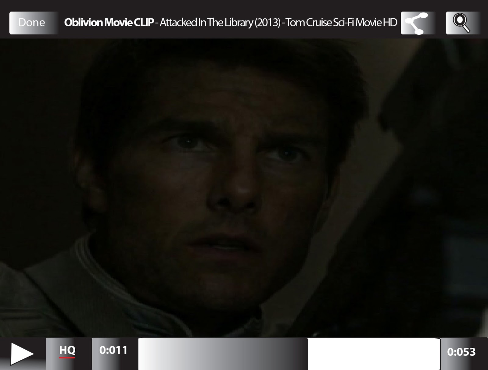
Video
This page appears if you have clicked on a certain video. Done using the same methods as others
Queue
This page is if there are any movies or shows you like, then you can add them to your queue, which you send to watch them on your TV or computer. Done using the same methods as other.


No comments:
Post a Comment