Tuesday, 30 April 2013

Summary of Term 2

Summary of Term 2

At the start of the second term most of the work we did was the same as with term 1. We did more weekly projects like designing adverts and logo for companies. I felt no new difficulties in the beginning of the new term. Then towards the end we got two big projects to do, a design of a kiosk interface and design a app for the ipad. This was a new experience for me in graphic design class and it was hard in some areas, mainly doing a lot more research and background work, but in the end I felt I did well and it was fun to do the big projects, well most of it anyway. The last thing was the blog and the website, which we had done for the whole year, that was nearing the end and it was probably the trickiest one for me because with so much going on with other projects I didn't have many chances to work on it, but still I got the blog up and running and my site is relatively okay so I think I might be able to do well in it. Overall I say the second term had much more to do then the first term with the two big projects we had to do, but still I felt I did well and enjoyed doing the projects.

Tuesday, 23 April 2013

Ipad App Interface Design

 Ipad App Interface Design

For This project we were asked to design a app to be used for the Ipad.

 Research

I decided to do a app that can be used to watch TV shows or Movies on the go. I looked up a lot of different design for any kind of app like this one e.g. Netflix Hulu plus etc., hoping to get some idea about how I wanted the app to look like. 


Navigation Chart


 This is a simple nav chat showing the basic structure of my app.


  Persona Chart


This is a persona chart, which shows who would be interested in the app. Mostly it would be for the young people but also I think it would be used by the older generation to , since almost everyone uses a ipad or even smartphone to watch TV or movies.

 Ipad App Design

 Main Menu 


This is the main menu page for my app. Shows a variety of different options. Done using Adobe Illustrator. Mostly used shapes, text and gradient.

 Types of Shows


This page shows you the various types of TV or Movies that you can see in different genres. Done using the same methods as other pages. Also used the pen tool.

 TV Show


This page gives you the info about any TV or movie you click on. Done using the same method as other pages

 Featured


This page shows you if there are any shows or movies featured. Done using the same methods as the other pages.

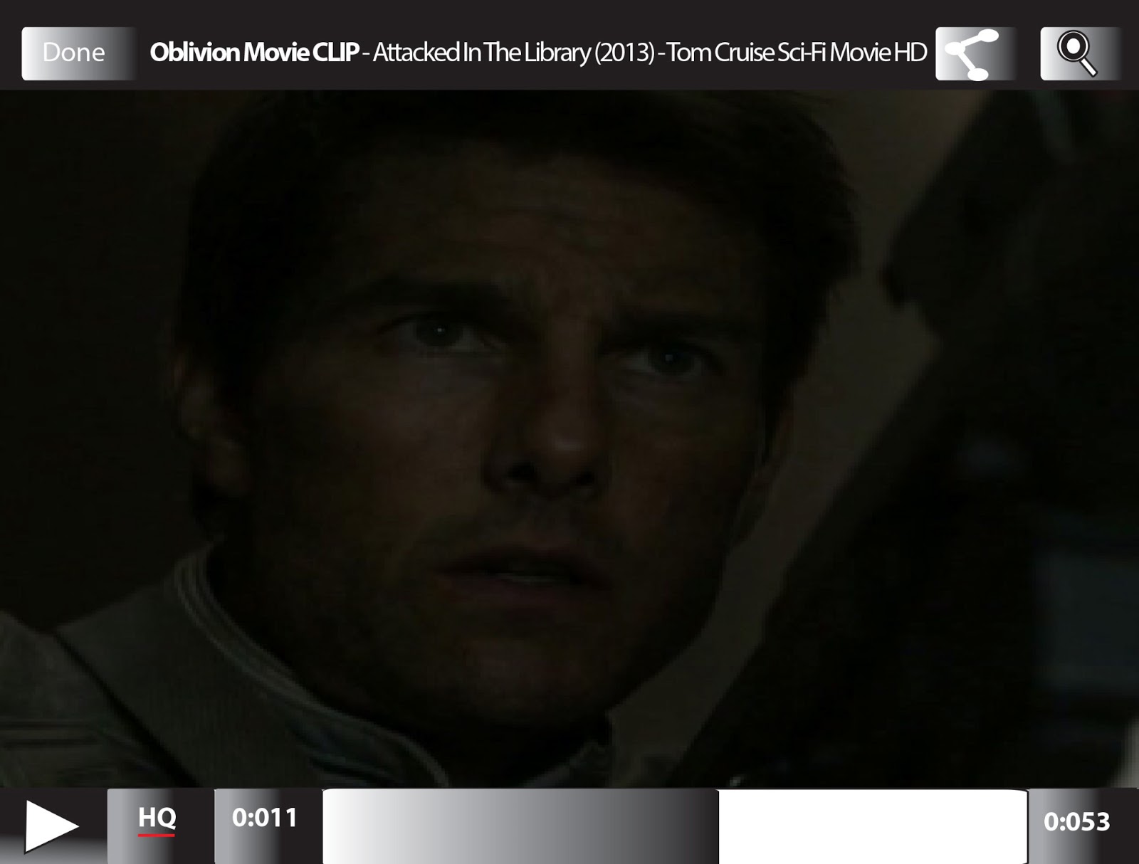
Video

This page appears if you have clicked on a certain video. Done using the same methods as others

Queue


This page is if there are any movies or shows you like, then you can add them to your queue, which you send to watch them on your TV or computer. Done using the same methods as other.

Monday, 8 April 2013

Kiosk Interface Design

Kiosk Interface Design

For this project We had to come up with a design for the interface  of a kiosk to use for the new Metro North Railway  

 Research and Development

Different Kiosk Designs

 
Before starting the project I did some research on the Metro North and above I have some pictures that I Took of different types of kiosks to see how they are designed and work.

Persona

 
This is a persona sheet that I did as part of my research. Its to show the kind of people who would mostly use the metro.

Navigational Chart


This is a Navigation chart, which shows the process of where you go after selecting the ticket option on the main page.

Interface Design


 Main Menu

This is the main page yo see when you first use the kiosk. There are 3 options Tickets, Route Map and Timetable. It was done using Photoshop using the basic shapes tool type and layer effects. The Ticket option is purple to show that it has been clicked.


Selecting Ticket

This is the ticket page, where you go to after clicking the ticket option on the main page. Done the same as main page. It shows the different options for selecting different types of ticket and if you want to purchase more than one.


 Zone 

This is the zone page after selecting your ticket type. Again done using the same method as the other two pages.  Here you can select where you want to go by selecting which zone the area is in.

 Payment

Here after selecting your zone you go the payment section. Done using the same methods as other pages. Here is where you choose how you are going to pay for your ticket and if you want to change your ticket or zone option if you made a mistake.
 

Processing Ticket

After that this page showing your ticket being printed. Done using the same method as other pages